Monday, June 4, 2012
History of Sports through MoMA/Field Trip #6 Reaction
Sports is one of the oldest interactive hobbies in the world. It can be played professionally or just as a good past time activity that you love. Nevertheless, it dates back thousands of years ago, from the Romans to the Egyptians and now everywhere. I found a few works from different artists to examine the long history of sports throughout the world. These artist have all done brilliant works, and the ones that i chose can represent the great works they do. Even though these artist uses different modems, you can still see some similarities within them.
The theme of my exhibit would be "History of Sports through MoMA". I chose this theme because sports is one of my favorite hobbies and since MoMA has a lot of interesting works on the different type of sports I figured that I wanted to do that. My art selections related formally by them having the same viewpoint as in the subject "Sports". The similarities that they share in appearance would be the evolution of the sport, from seeing how it used to be to what it is today. While some of the rules might of changed, it still has the similarly equipments use to play the games. Nevertheless, the equipments will be different from those many years ago but with the same conceptual form and shape it will remain the same as in relation to the name of the sport.
These pieces do not evoke any common feelings or meanings for me, it simply makes me respect them more because of where they came from. The other similarities that i can draw from these pieces is that from the colors used by most, viewers can tell how old or how long ago the work was intended to represent. My analysis was not affected by knowing where or when the work was created because for something to last that long it shows how popular it has become. Also the works shows the evolution of the sports.
Gustavs Klutsis
"Postcard for the All Union Spartakiada Sporting Event"
1928
Offset lithograph
Gustavs Klutsis
"Postcard for the All Union Spartakiada Sporting Event"
1928
Offset lithograph
Gustavs Klutsis
"Postcard for the All Union Spartakiada Sporting Event"
1928
Offset lithograph
Gustavs Klutsis
"Postcard for the All Union Spartakiada Sporting Event"
1928
Offset lithograph
Gustavs Klutsis
"Postcard for the All Union Spartakiada Sporting Event"
1928
Offset lithograph
Gustavs Klutsis
"Spartakiada Moskva"
1928
Letter Press
Gustavs Klutsis
"Postcard for the All Union Spartakiada Sporting Event"
1928
Letterpress
Gustavs Klutsis
"Postcard for the All Union Spartakiada Sporting Event"
1928
Offset lithograph

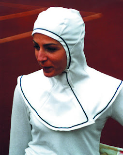
Cindy Van Den Bremen
"Capsters Sports Headgear for Muslim Women. Skate version"
1999
Polyamide and elastane
Cindy Van Den Bremen
"Capsters Sports Headgear for Muslim Women. Tennis version"
1999
Polyester
Richard Avedon
"Lew Alcindor, basketball player, New York"
May, 2nd 1963
Gelatin silver print, printed 1990
Francis Benjamin Johntson
"A football team"
1899-1900
Platinum print
Henry Taylor
"The Long Jump by Carl Lewis"
2010
Acrylic on canvas
Sigmar Polke
"Untitled from the series TV Picture Ice Hockey"
1973
Gelatin silver prints
Slazengers Ltd. England
"Cricket Bat"
Before 1962
Wood with rubber grip
Sunday, June 3, 2012
“Chelsea Galleries Reaction”
An artist whose work that I would like to collect would be Nicole Eisenman. The most intriguing thing that I can find that I like about this artist's work would be the creative ways how she uses faces to show emotions. I found it very interesting as to the different ways she used different materials to showcase a frame of emotion. In one of her works she has different faces but with the same emotion and different materials used to make them.
I believe that this artist's work would be a good investment because of the style and creativity that she sustains in them. She puts different perspective on the same images, therefor giving viewers different ways of looking at it. Her works are mainly about people and she showcases how people's emotional posture varies.
I would proudly display this artwork instead of keeping it in a storage. In my opinion this work deserves to be displayed because it is just an mesmerizing piece. She combined printmaking with various materials and techniques to produce a wonderful piece. One of her works that i found interesting was the piece "Twelve Heads" and another was "Contagion". The gallery in which i visited and found these works at were at west 23rd Street in Chelsea New York.
Nicole Eisenman
"Twelve Heads"
"Contagion"
2012
Sunday, May 13, 2012
Darren's Roti w/ Curry Chicken( Caribbean Style)
This recipe is actually a favorite of mines. Its one my Mother makes which she learned from her mother and I'm trying to learn too. Also, its a quite popular dish amongst West Indian and Caribbean culture. It's usually eaten like a taco or burrito, but can be eaten in various ways. I call it the Caribbean burrito.
Ingredients:
1/2lb Flour
1/2 lb Chicken
Potato(optional)
Curry Powder
Seasoning
1 rolling pin
Water (varied)
Medium bowl
Skillet
Directions:
1. First you pour your flour into the bowl, then you add the water (the amount you need is varied) and as you are adding it, use your hands to mix them together until the flour becomes thick (if it is too soft then add some more water until it gets thick).
2, After you mix your flour you will need to cut up your chicken and seasoned it. If it is already cut up then you will just need to add the seasoning. Next, add your chicken to a cooking pan and put the fire on low to let it steam.
3. Back to your flour. Take a small portion of the flour and roll it in to a ball (baseball size is perfect). Then, you take your rolling pin (if you do not have one then you can use a large size glass bottle) and roll out the flour ball in to a circle. Add it to the skillet( Do not add a large amount of oil to the skillet, 1 tbsp is perfect). Flip it once it starts to brown and once both sides are brown it is done.
4. After your chicken has steamed you will need to add a half ounce of cooking oil to the pot. After that you will need to add the curry powder. Once the oil starts to simmer, you will then need to add about a half cup of water and add your potato then cover it down. You will know it is done when your potato gets soft.
5. Enjoy :)
Tuesday, May 8, 2012
“Sculpture Center Reaction”
On our fourth field trip, our class went to "The Sculpture Center". This to me was really different than the other art museums that we went to. It was a huge amount of space that was taken up by little amount of art work, and some of the works really looked like regular everyday stuff that you would actually find in a...not a dump to be exact but some abandoned places, and some homes, or on the street. Things that you see everday that you would not considered "art". Works such as the "Cyclone Fence", "Untitled" and "Rope Piece" would seem as junk to some people, and that was what was going through my mind also.
The artworks do not seem very affected by the space and architecture because there is alot of room in which they can fit. The history and location of the space does not inform my perception of the works because the works are regularly being moved from different institution and depending on that institution (old or new) the works will still have the same look. The artworks does not change my perception of the space because of the history of the space, I already knew what to expect. The Sculpture Center used to be a warehouse so normally you would visualize a big amount of space with rust and that was normally what it was.
The artwork would most likely have the same affect on me depending on if the space was similiar to the "Sculpture Center's". Nevertheless, if the center is brand new then that would most likely change me perception, because the works might not match the enviroment.
Within their surroundings the artworks interact with each other by most of them complementing eachother by realization that the works which are made from materials which can be found in everyday life are similar to eachother.
Bill Bollinger
"Cyclone Fence"
1968
"Untitled"
1970
"Rope Piece"
1969
Sunday, April 29, 2012
Illustrate a Story
What i found interesting in this story was that how unexpecting life can be at times. From someone having everything to then having nothing at all. In this collage i illustrated scenes from the beginning to the end of her story, so as you listen to the story you can also follow the images to further understand what is going on.
Design in Our Lives
Recently, our professor took us on our third field trip. It was to the Museum of Modern Art. There we had the opportunity to view works of great dimensional designs.The two works of arts in which i found to have "high functionality" would be the Puma Bike from the Puma Tribanded Collection by Jens Martin Skibsted, Adam Thorpe, and Joe Hunter and the XXXX_Sofa by Yuya Ushida.
I believe that these two works have "high functionality" because of the designs. Puma Bike is actually a well working and functional bike that likely perform on the same or even better level as a ordinary bike. Its fold in half design means that you can actually store it in a small place where it would not take up as much as space as an ordinary bike would. Also, it will be more maneuverable. The XXXX_Sofa is less maneuverable, but it is definitely more longer lasting than most sofas. It looks fairly comfortable also, and with a little padding I'm sure it will be just fine. What i find these two objects to have in common would be the very well design. They are both ergonomic because they are both designed for different purposes but are the same when it comes to creativity.
The two works of arts in which i would find to have "low functionality" would be the Timor Perpetual Calender by Enzo Mari and the Designs for an Overpopulated Planet: Foragers by Anthony Dunne & Fiona Raby. The Perpetual Calender is fairly designed but it looks like it can be a little confusing to some and also a little fragile too as to if it was to fall from a medium height it would break easily. The Designs for an Overpopulated Planet: Foragers work looks very interesting, it looks like something that can definitely be put into use. Nevertheless, it looks very uncomfortable. Having to carry some of the parts physically, and the size of some of the items are to big. If somehow they can design a more manageable and more comfortable way of carrying the items, then it would be perfect. In common these two low functionality works has illegitimate designs that would not seem very useful, one is to small and the others is to big. I would alter these projects to make them more ergonomic by resizing them so that they will not be a burden on the host.
Objects do not to be highly functional to be good designs. As long as the quality of the object is good and the purpose of what the object is designed to do is also good, then the object itself shall be good. I believe that ART and DESIGN are not one separate idea, but in fact are equals. Art is in a way a design of an object, place, or thing that you create, while designs are art-based because of the tranquility of the shapes, lines or the way that the designer puts together their work.
Jens Martin Skibsted, Adam Thorpe, and Joe Hunter
"Puma Bike from the Puma Tribanded Collection"
Aluminum. 2004
Yuya Ushida
"XXXX_Sofa"
Polyamide plastic. 2011
Enzo Mari
"Timor Perpetual Calender"
Plastic. 1966
Anthony Dunne & Fiona Raby
"Designs for an Overpopulated Planet: Foragers"
Video. 2009
Sunday, April 1, 2012
“MoMA PS1: The Good, the Bad, and the Misunderstood”
Recently, my class had went on a field trip to "MoMA PS1". There, we encountered a vast majority of well-donned art from lesser known artists. In some case, people would consider most good and others bad..but are they really bad, if there considerable enough to be hung in a museum? One of the arts the i found that i believe was "Good", was The Long Jump by Carl Lewis. In the painting, the artist painted Lewis at the Olympic games where he set his record long jump and won the gold medal. However, the artist painted him jumping over a prison system and safely landing home. I think its a powerful message because most African-Americans have an image of them always being in jail. The artist shows that African-Americans can overcome that astigmatism and be productive in life. The one in which i thought was "bad" was the Tim and Gaffi piece. It was basically a desktop background with what looks like a picture of oatmeal, a bull cow holding a trophy, and a calculator pasted on in. I did not understand one bit what that piece was about but it was creative. Apiece that many like me would find misunderstood at first was The Forty Part Motet. Now when you first encounter this piece, you will see that it is actually forty individual pieces of speaker positioned around a wide open room playing music. However, when you carefully listen, you will see that each section of speakers has their own individual sound and they blend together to make one magnificent melody. I thought it was quite brilliant, as to the large amount of space in the room it makes the sound perfect.
The Long Jump by Carl Lewis: Artist:Henry Taylor (2010)
Tim and Gaffi, Artist: Darren Bader (n/a)
The Long Jump by Carl Lewis: Artist:Henry Taylor (2010)
Tim and Gaffi, Artist: Darren Bader (n/a)
Sunday, March 18, 2012
Project #1 Art Blog: Good Art Vs. Bad Art
The objective of a Good Art is to captasize the viewers vision and imagination. It therefore gives them a different and unique way of viewing. A good art dosent necessary mean that it had to take a long time for it to be done. It can be done in little amount of time and still be considerably "Good". As long as the features includes, good quality, good craftsmanship, etc. The thing is, is that it has to catch the viewers eyes. On the other hand, Bad Art defines the meaning of everything that you did wrong while constructing your work. If you did not put no effort or time into your work then it will show and come out as "Bad". Bad Art consists of not giving it your all, making lackluster judgements towards your work (i.e. saying "its no problem, i can get it done tomorrow"). Instead of that, you should put your full passion into completing your work.
GOOD ART
GOOD ART
BAD ART
Subscribe to:
Posts (Atom)